How To Reduce Bounce Rate And Keep Visitors Hooked

By Mriganka Bhuyan
•Founder at Munch
If you want to stop visitors from leaving your site, you first have to figure out why they're bouncing in the first place. I've found it almost always boils down to one of three things: your page loads at a snail's pace, your content doesn't match what they expected, or your user experience is a hot mess. Tackling these head on is the quickest way to convince people to stick around.
Why Visitors Vanish and What It's Actually Costing You
Think of a high bounce rate as someone walking into your store, taking one look around, and immediately walking right back out. It’s a huge, flashing neon sign that your landing page and your visitor's expectations aren't just misaligned, they're on different planets.
This metric is all about the percentage of people who land on a page and then leave without doing anything else. No clicks, no form fills, nothing.
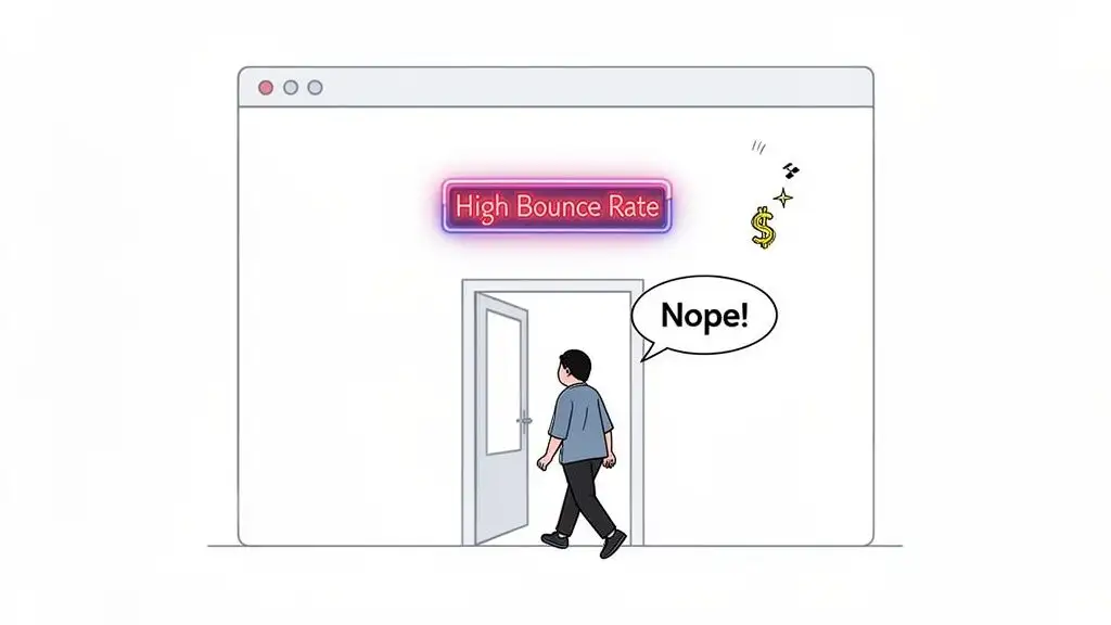
But it's more than just a "single-page visit." A bounce is a snap judgment on relevance. It's your visitor silently telling you, "This isn't what I came for." You failed to deliver on the promise that got them to click.
The Usual Suspects Behind a High Bounce Rate
So, what are the biggest culprits? Let's get into the nitty gritty.
A massive one is mismatched intent. For example, someone searches for "SDR automation tools" and clicks your shiny ad. But instead of a page about your awesome automation features, they land on a generic homepage talking about your company culture. They're gone. Your ad promised them a lightsaber, but your landing page handed them a pool noodle.
Another killer is sluggish page load times. We live in an "I want it now" world. If your page takes more than three seconds to load, you might as well be sending the information by carrier pigeon. People have zero patience for slow sites; it's a one way ticket straight back to the Google search results.
And finally, let's talk about the user experience (UX). A cluttered page, tiny text, or navigation that feels like assembling IKEA furniture without the instructions will send visitors running for the hills. If they can’t figure out what to do or where to go in a few seconds, they're not going to stick around to solve the puzzle.
The Real Cost of a Bounce
A high bounce rate isn't just a number to frown at in your analytics report. It has real, painful consequences for your business. Every single bounce is a lost opportunity that hits your bottom line.
A bounce isn't just a statistic; it's a potential customer you paid to acquire who decided your offer wasn't even worth a second glance. Each bounce is wasted ad spend and a new hole in your sales pipeline.
Here’s a breakdown of what that high bounce rate is really costing you:
-
Wasted Ad Spend: You paid for that click, whether it was on Google Ads or a social media campaign. When a visitor bounces, that money vanishes into thin air.
-
Lost Pipeline: That person could have been your next big client, but they bailed before they even saw your "Request a Demo" button. The conversation was over before it even began.
-
Damaged SEO Signals: While Google says it's not a direct ranking factor, a consistently high bounce rate can signal that your page isn't a good answer for a specific search query. Over time, that can definitely hurt your rankings.
Getting a handle on these numbers is non-negotiable. If you want to connect the dots between bounces and business outcomes, it's worth exploring the essential lead generation KPIs every team should monitor. At the end of the day, learning how to reduce your bounce rate is really about turning those missed connections into valuable customers.
Become a Bounce Rate Detective to Find the Real Problem
Before you start frantically changing button colors and rearranging your homepage like a chaotic episode of Tidying Up with Marie Kondo, you need to put on your detective hat. A high bounce rate is a symptom, not the disease. The real cure comes from diagnosing the problem, and that means getting your hands dirty in the data.
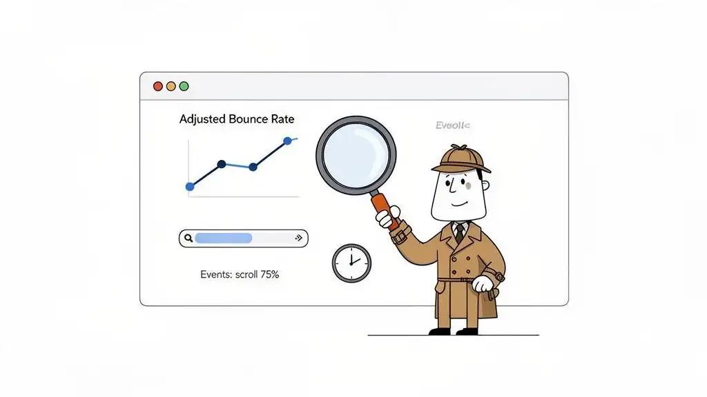
Here's a little secret: the default bounce rate in Google Analytics is a liar. Seriously. By its standard definition, a "bounce" is just a single-page session. This means if someone lands on your blog, devours the entire article, finds the exact answer they needed, and leaves completely satisfied, they're still counted as a bounce. That’s not a failure; that's a home run!
This is why your very first move should be to redefine what a "bounce" actually means for your site.
Configure an Adjusted Bounce Rate for a Truer Story
To get a more honest look at what's happening, you need to set up what’s known as an adjusted bounce rate. This is where you tell your analytics platform to pay attention to meaningful interactions that go beyond just clicking to another page. It's about measuring genuine engagement, not just aimless navigation.
Here are a few events you can set up to stop counting engaged visitors as bounces:
-
Time on Page: Fire an event if a user sticks around for more than 15 or 30 seconds. If they’re on the page that long, they’re clearly not bouncing out of disgust.
-
Scroll Depth: Trigger an event when a user scrolls, say, 75% of the way down a page. This is a dead giveaway that they’re actually reading your content.
-
Key Actions: Track clicks on important elements that don't load a new page. Practical examples include playing a video, downloading a PDF, or clicking a "mailto" link.
Setting up these events gives you a much clearer view of which pages are actually underperforming. If you want to get into the nitty gritty, you can explore how to properly track website visitors and their actions. This is your first step to separating the signal from the noise.
Segment Your Data to Find the Culprits
Once you have a metric you can trust, the real detective work begins. A site-wide average bounce rate is mostly a vanity metric. You have to slice and dice your data to find the specific areas that are bleeding visitors. Think of it like a scene from CSI: you have to isolate the evidence to pinpoint the perp.
Start by segmenting your bounce rate analysis by these key dimensions:
-
Traffic Source: Are visitors from your LinkedIn ads bouncing more than organic search visitors? This might mean your ad copy is writing checks your landing page can't cash.
-
Device Type: Is your mobile bounce rate through the roof compared to desktop? Your mobile experience might be clunky, slow, or just plain broken.
-
New vs. Returning Visitors: If new visitors are bailing at an alarming rate, your site's first impression might be falling completely flat.
-
Specific Landing Pages: Which pages are the worst offenders? For example, a high bounce rate on a key blog post from organic search feels like a classic bait and switch to users. The content just doesn't match what they were looking for.
To quickly identify where you might have issues, I've put together a little cheat sheet.
Common Bounce Rate Culprits and Their Fixes
This table can help you translate what you're seeing in your analytics into a likely cause and an immediate action you can take to start fixing it.
| Symptom (What you see in analytics) | Likely Cause | First Action to Take |
|---|---|---|
| High bounce rate from a specific ad campaign | Ad-to-Page Mismatch: Your ad promises one thing, but the landing page delivers another. | Rewrite ad copy or redesign the landing page to create a seamless, consistent message. |
| Sky-high bounce rate on mobile devices | Poor Mobile Experience: The page is slow to load, hard to read, or difficult to navigate on a small screen. | Run a mobile-friendliness test and check page speed scores specifically for mobile. |
| High bounce rate on a top-ranking blog post | Search Intent Mismatch: The content doesn't answer the user's question, or the answer is buried. | Review the top search results for that keyword. Restructure your content to match the format and answer the core question immediately. |
| High bounce rate across all new visitors | Confusing Value Proposition: Visitors don't understand what you do or why they should care within the first 5 seconds. | A/B test your headline and hero section. Make the value proposition crystal clear. |
| Bounce rate spikes on product/pricing pages | Sticker Shock or Lack of Trust: The price is higher than expected, or there aren't enough trust signals (reviews, testimonials). | Add social proof, a clear money-back guarantee, or offer a value comparison to competitors. |
Think of this table as your starting point. It turns vague data points into a real, actionable to-do list.
By segmenting your data, you stop guessing and start diagnosing. Instead of saying, "Our bounce rate is high," you can say, "Visitors from organic search on mobile devices are bouncing from our pricing page at an 85% rate." Now that’s a clue you can work with.
This detailed analysis is what separates the marketers who make real improvements from those who just tinker. Before you change a single word or image, become a data detective. Pinpoint exactly where, why, and for whom your site isn't working. Only then can you start applying the right fixes.
Your First Line of Offense: Quick Wins for Lowering Bounce Rate
Alright, you’ve done the detective work. You’ve sifted through the data and have a solid list of suspects for why people are bouncing. Now it’s time to stop analyzing and start doing. Forget about that massive six month website overhaul for a minute. We're talking about quick, high impact fixes that can show results, fast.
This is all about grabbing the low hanging fruit, the simple changes that stop the bleeding and convince visitors to give your page a second look.
Think of this as your first line of defense. These are the fundamental tweaks that hit the most common reasons people leave. Get these right, and you’ll create a much stickier experience from the moment someone lands on your page.
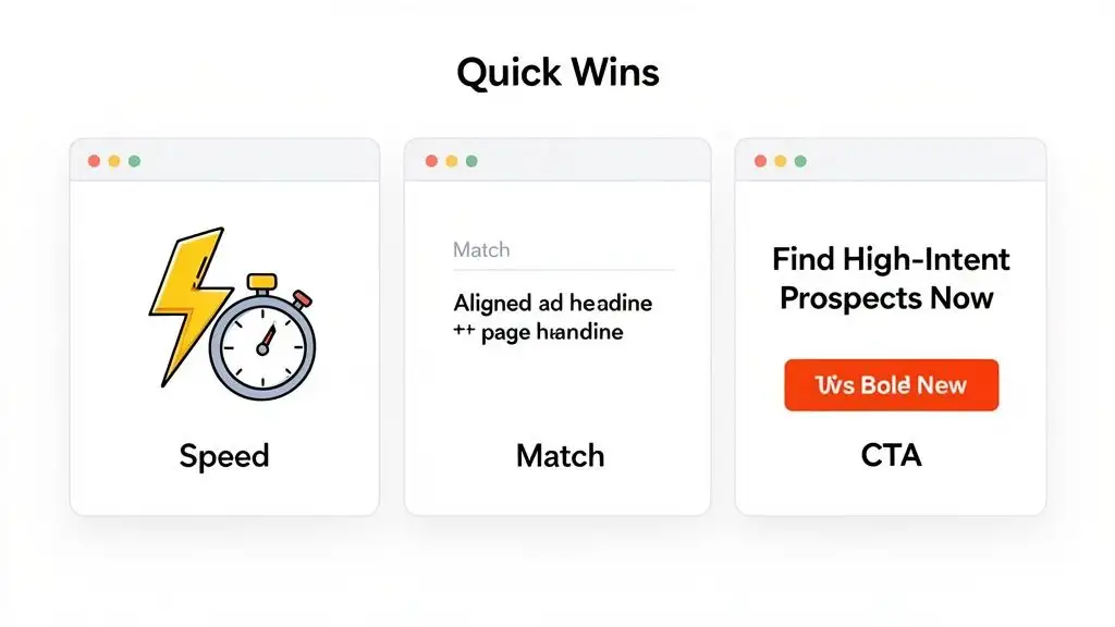
Make Your Page Load Faster Than a 90s Sitcom Intro
In an age of instant everything, page speed isn't some nerdy technical detail; it’s a cornerstone of the user experience. If your site takes longer to load than that old dial up modem sound from 1998, visitors are gone. They're not going to hang around to see your brilliant value prop or slick design if they're stuck staring at a blank screen.
Google's data is pretty stark: the probability of a bounce skyrockets by 32% as page load time goes from just one to three seconds. That's a massive cliff to fall off of for a two second delay. Your goal? Get your key pages loading in under three seconds. No excuses.
Here are a few practical ways to shed some weight and pick up the pace:
-
Compress Your Images: That gorgeous, high-res hero image? It might be the very thing killing your load time. Use a tool like TinyPNG or Squoosh to shrink file sizes without turning your pictures into a pixelated mess.
-
Leverage Browser Caching: This is like telling a visitor's browser, "Hey, save these files locally." When they click to another page, static elements like your logo and CSS files don't need to reload, making the rest of their visit feel almost instantaneous.
-
Use a Content Delivery Network (CDN): A CDN is a game-changer. It stores copies of your site on servers all over the world. When someone from London visits, the content loads from a server nearby, not from your main server in California. It's a simple way to slash load times for a global audience.
Nailing your page speed is the digital equivalent of having a clean, welcoming entryway to your store. It's a non-negotiable first impression that sets the stage for everything that follows.
Eliminate the Dreaded Intent Mismatch
I'd argue that the single biggest offender for a sky high bounce rate is the intent mismatch. This is what happens when the promise you make in an ad, a social post, or a search result doesn't line up with what the visitor actually finds on the landing page. It's jarring, and it instantly shatters trust.
For example, your LinkedIn ad screams, "AI-Powered Personalization for SDRs." An intrigued prospect clicks, ready to see the magic, only to land on a generic homepage with the headline, "Welcome to Our Company." Ugh. That’s a classic bait and switch. They were expecting a specific solution and got a vague corporate brochure instead. The back button gets clicked before they even know what happened.
Your headline and opening sentence are the most critical pieces of copy on the page. They must instantly confirm to the visitor that they are in the right place and that you have the solution to their specific problem.
Fixing this is all about creating a seamless "message match" from the click to the conversion. If the ad promises "AI-Powered Personalization," the landing page headline had better echo that promise, like "Instantly Personalize Outreach for Every Prospect with AI."
This alignment reassures visitors that they've made a good click and gives them a reason to stick around. You can dig deeper into how to structure these user journeys by learning how to create workflows that guide prospects.
Make Your Content Scannable, Not a Novel
Once you’ve reassured the visitor they're in the right spot, you have to make it easy for them to find what they're looking for. Let’s be real: people don’t read websites, they scan them. Your job is to make your page as scannable as possible so they can pull out the information they need in seconds.
Think less academic paper, more Buzzfeed listicle. Use formatting to guide their eyes and make the important stuff pop.
-
Short Paragraphs: Keep your paragraphs to 1-3 sentences, max. This creates precious white space and makes the text feel way less intimidating.
-
Clear Headings and Subheadings: Use descriptive H2s and H3s to break your content into logical chunks. This lets users jump right to the sections that matter most to them.
-
Bullet Points and Numbered Lists: These are your best friends for listing features, benefits, or steps. They're incredibly easy to scan and digest.
Improving readability isn’t about dumbing down your content. It’s about respecting your visitor’s time and making your message as clear and accessible as humanly possible.
Craft a Call to Action That Demands a Click
Finally, every single page needs a clear purpose. What is the one thing you want the visitor to do next? Your call to action (CTA) is the big, bright signpost that directs them. Weak, passive CTAs like "Learn More" or "Submit" are bounce rate magnets because they’re boring and create zero urgency.
Your CTA should be an active, benefit driven command. Instead of "Learn More," try something specific and compelling that tells them why they should click.
Here’s a quick before and after:
| Vague & Passive CTA | Specific & Active CTA |
|---|---|
| Learn More | See How It Works |
| Submit | Get Your Free Demo Now |
| Download | Grab My SDR Cheat Sheet |
| Contact Us | Talk to a Sales Expert |
A strong CTA makes the next step obvious and desirable. It pulls a passive reader into your world and turns them into an active participant. This principle of engagement is why top platforms keep you hooked. High bounce rates often plague B2B pages, but the best sites show us how to cut them down. For instance, in 2023, YouTube had a stellar 34.29% bounce rate despite 83 billion visits, all by using video recommendations to keep users clicking. Meanwhile, Twitter languished at 71.46%. B2B sites can copy this playbook by using rich, contextual content that pulls users deeper into the discovery process, as you can see by checking out these bounce rate statistics and insights.
Your Secret Weapon: Personalized Content That Makes People Stick Around
Let’s be honest. Treating every visitor the same is a surefire way to get them to hit the back button. Generic content is the digital equivalent of a monotone sales pitch. It's lazy, it’s boring, and it practically dares people to leave.
If you really want to slash your bounce rate, you have to get personal. This isn't about some creepy, dystopian level of targeting; it's about being genuinely helpful. It’s about creating an experience that makes a visitor feel like you built the page just for them.
When you nail that sense of relevance, people don't just stay. They lean in, pay attention, and are far more likely to convert.
Dynamic Content: The Ultimate "This Is For You" Signal
Imagine a founder from a hot new fintech startup lands on your homepage. Instead of a bland "Welcome to Our Platform," they see: "The Sales Intelligence Platform Built for Fintech Innovators."
Boom. That’s an instant connection.
This is the magic of dynamic content. It’s where you automatically swap out page elements like headlines, images, and testimonials based on who's looking. You can use data from their IP address to figure out their company or location, or even from the specific ad they clicked.
So that fintech founder? They won't just see a tailored headline. They'll also see a glowing testimonial from another fintech leader, not some random case study from a manufacturing company. That one little switch changes their entire experience from, "Hmm, maybe this is for me," to "Wow, these guys get it."
Here are a few practical ways to put this into practice:
-
Industry-Specific Headlines: Switch your H1 tag based on the visitor’s industry (think "SaaS," "Healthcare," or "E-commerce").
-
Company Size Logos: If you serve scrappy startups and massive enterprises, show them logos of companies they’ll recognize as peers.
-
Geographically Relevant Offers: A visitor from London sees pricing in GBP, while someone from New York sees USD. Simple, but incredibly effective.
This isn’t just a neat trick. This level of detail shows you’ve done your homework, builds instant trust, and makes your solution feel like a perfect fit. It's a powerful reason to stick around.
Weave a Web of Internal Links
Okay, so you've hooked them with some slick personalization. Don't let them hit a dead end. Every single page should offer a clear, logical next step. This is where a smart internal linking strategy turns your website from a static brochure into a "choose your own adventure" experience.
For example, a visitor lands on a blog post about improving cold email reply rates. Within that article, you can naturally drop a link to a feature page about your AI powered email tool. From there, another link might guide them to a case study where a similar company doubled its meeting bookings.
Each click should feel like the next logical step in their journey. You're not just presenting information; you're guiding them toward a solution, one helpful link at a time. This keeps them engaged and moving deeper into your site.
This is about so much more than SEO. You're creating a seamless user journey that encourages exploration and gently guides visitors from mild interest to genuine consideration. Every extra page they visit is another win against your bounce rate. If you're curious how to pull this off, you can learn more about how smart data integration can power these journeys by checking out the best data enrichment tools available.
Benchmarking Your Personalization Efforts
So, how do you know if any of this is actually working? It all comes back to benchmarking. First, you need to understand your industry's standards, then you can set your sights on blowing them out of the water.
Let's talk numbers. For many B2B sales pages, the standard bounce rate is a hefty 65.17%, but that's a totally beatable number. Look at the top global sites in 2023: they averaged 48.24%. When they added interactive elements, pages per visit shot up to between 3-8.
The high performing B2B companies get their bounce rates below 50.59% by personalizing every interaction they can. They're actively turning those potential 65% bounces into engaged prospects. You can dig into more average bounce rates by industry to see exactly where you stack up.
Combine killer dynamic content with a strategic internal linking map, and you create an ecosystem that is incredibly sticky. Visitors arrive, feel understood, and are given a clear path to follow. They don't bounce because, from their perspective, they've finally found someone who speaks their language.
Putting It All Together: A Playbook for Your Team
Alright, enough with the theory. Staring at analytics dashboards is great, but it doesn't close deals. All that data is useless unless you actually do something with it. It’s time to bridge the gap between "we should fix this" and "we're fixing this, starting Monday."
Here’s a straightforward, no nonsense playbook for your sales and marketing teams. Think of it as a recurring team huddle: a quarterly ritual to make sure your most important digital real estate is actually inviting people in, not sending them running for the hills.
The Quarterly Bounce Rate Audit Checklist
Forget those massive website overhaul projects that get announced with fanfare and then quietly die six months later. Real, lasting improvement comes from small, consistent tweaks. This checklist is your team's guide to sniffing out and squashing the most common bounce rate killers on your money pages.
And no, you don't need to audit every single page on your site. That's a recipe for burnout. Just focus on the pages that carry the most weight for your business, like your demo request page, the pricing page, and maybe your top three blog posts that bring in the most traffic.
Here’s what to look for on each of those high priority pages:
-
Message Match: Does your H1 headline deliver on the promise from where the visitor just came from? If your Google Ad screams, "The Easiest Way to Find High-Intent Prospects," your landing page headline had better not be "Welcome to Our Platform." The transition needs to be buttery smooth.
-
The Three-Second Rule: Is the page fully loaded and interactive in under three seconds? Pop the URL into Google PageSpeed Insights. If you're slow, compressing your images is the lowest hanging fruit and your fastest win.
-
The Above-the-Fold Test: Can someone understand what you do and what they should do next without touching their mouse wheel? If your core value prop and call to action are buried below the fold, you've already lost half the battle.
-
Internal Linking: Are there at least two logical, relevant internal links that can take a curious visitor deeper into your site? Every page should be a stop on a journey, never a dead end.
-
Mobile Experience: How does it look and feel on a real phone? Don't just trust the "mobile view" in your browser. Grab your phone and actually try to use it. The buttons, the forms, and the navigation should all feel natural, not like a scene from Honey, I Shrunk the Kids where everything is impossibly tiny.
Connecting Actions to Real Business Goals
Let's be clear: this audit isn't just marketing busywork. Every single item on that checklist ties directly back to a real business outcome. This is how you get buy in from the C suite and prove that marketing is driving revenue, not just spending a budget.
For example, fixing the bounce rate on your demo request page isn't about vanity metrics. A lower bounce rate there means more meetings booked. Period. It's a straight line from a better user experience to more pipeline for the sales team. You're simply making it easier for interested people to take the next step.
A clear path through your content is what guides visitors down the marketing funnel. If you want a refresher, you can explore the key stages of a B2B marketing funnel and see how these optimizations fit into the bigger picture.
The goal is to create a virtuous cycle. You test something, you learn from the data, and you improve. Then you do it all over again next quarter. This continuous optimization is what separates good teams from great ones.
This diagram breaks down how you can evolve your content from a generic, one size fits all approach to a much more engaging, personalized experience.
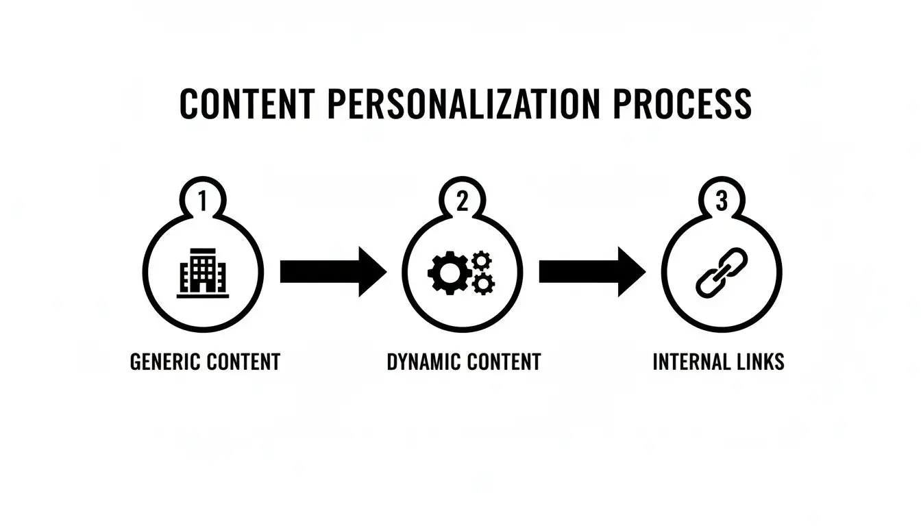
This process is about turning a static website into a dynamic guide. You're using smart internal linking to help users find what they need, which naturally keeps them around longer. By transforming your site into a genuinely helpful resource, you'll start turning more of those quick bounces into high-quality leads that stick around.
Your Burning Bounce Rate Questions, Answered
You've got questions, and when it comes to bounce rate, there's a ton of noise out there. Let's cut through the chatter and tackle the most common head scratchers so you can get back to what matters: keeping people on your site.
What’s a Good Bounce Rate to Aim For?
Honestly, that’s like asking, "What's a good score in a video game?" It totally depends on the level you're playing. A "good" number is all about context.
For something like a B2B SaaS homepage or a crucial pricing page, you should be shooting for the 30-50% range. That's a solid goal. But what about a blog post that perfectly answers one specific question? A bounce rate of 70-80% could be completely fine. The user got what they needed and left happy. Think of it like watching a perfect, one off episode of The X-Files.
The only benchmark that truly matters is your own. Stop obsessing over industry averages and focus on a consistent downward trend for your most important pages. Beating your own numbers is the only game worth playing.
How Much Does Mobile Experience Really Affect Bounce Rate?
A bad mobile experience isn't just a minor issue; it's a full blown bounce rate catastrophe. With Google’s mobile first indexing, a clunky, slow loading, or impossible to read mobile site doesn’t just frustrate people, it actively torpedoes your SEO. Thinking your B2B audience is glued to their desktops is a classic rookie mistake.
Just think about it. Your prospects are scrolling through emails and browsing sites on their phones between meetings. If they have to pinch and zoom like they're trying to crack a safe just to read your content, they’re gone.
Here’s a quick gut check for your mobile site:
-
Is it responsive? Does your site gracefully adapt to any screen size?
-
Is it "fat finger friendly?" Are your buttons and links big enough for a thumb to actually tap them?
-
Is navigation a breeze? Can someone find what they need without getting lost in a labyrinth of menus?
-
Is it fast? Does it load snappy on a shaky 4G connection, not just on your cushy office Wi-Fi?
Are Pop-ups Killing My Bounce Rate?
Oh, you bet they can. An aggressive, in your face pop-up that appears the second someone lands on your page is the digital equivalent of a salesperson tackling you at the door. It’s jarring, desperate, and one of the quickest ways to send someone packing.
But that doesn't mean all pop-ups are evil. It's all about timing and being smart. Instead of ambushing your visitors, try a more strategic approach.
Trigger your pop-ups based on actual user behavior:
-
Exit-Intent: These only show up when someone's cursor drifts towards the back button. It’s your last ditch effort to make a compelling offer.
-
Time on Page: Wait until a visitor has been on the page for at least 30 seconds. This proves they have some level of interest before you interrupt.
-
Scroll Depth: Trigger the pop-up only after someone has scrolled 50% of the way down the page. They're clearly engaged, so your offer is more likely to be welcomed.
This way, your pop-up feels like a helpful suggestion, not a hostile takeover.
Ready to stop guessing and start finding high-intent prospects who actually want to talk to you? Munch unifies lead discovery, data enrichment, and AI-powered outreach into one seamless workflow, turning bounces into booked meetings. Find your next customer with Munch.